9 Empty state best practices for UX design in 2023
Similar to a map, empty states—instructional directions on a web page or in software—guide the user on a journey through your website or software. Imagine trying to plan a road trip to a place you’ve never been while using a map that is missing big pieces of information. An empty state is a screen that fills in those blanks. With thoughtful web design and placement, these screens can make the difference between a happy user and a frustrated one who abandons your site midway through.
Start offering white-label website services to get web design clients today. Download “6-Step Guide to Selling Website Services to Local Businesses” right now.
According to IBM, every dollar invested in ease of use returns $10 to $100, states Megan Hartman, apprentice at UXbeginner. This ROI is just one reason to spend more time deciding which ecommerce platform is right for your business and clients. The user experience (UX) is becoming increasingly important for customer satisfaction, engagement, acquisition, and retention. Depending on how user-friendly your platform or products are, UX best practices can make or break your client list.
Empty states are an important concept for those who support local businesses in moving to ecommerce and digital solutions. A great user experience is synonymous with a great first impression; it’s integral to the relationship between a local business and a trusted local expert. Well-designed empty state UX ensure that your solutions and business website look professional. This helps to give prospective customers a positive first impression of your business, spurring trust and confidence in your ability to guide them.
What is empty state UI?
Empty state UI refers to the design of the screen or interface that users see when there is no data or content to display. This empty state screen can be a landing page, a dashboard, or any other interface that users interact with. Often overlooked, It provides an opportunity for designers to communicate with users and guide them through the user journey. By designing an effective empty state UI, designers can ensure that users remain engaged and satisfied with the product or service.
Empty state UI guides users to take a desired action. It communicates the reason why there is no content and provides instructions for adding content or completing a task. For example, a note-taking application may display an empty state screen with the message "Get started by creating a new note" and a prominent call-to-action button that prompts the user to create a new note.
The empty state UI can also be an opportunity to showcase the application's brand and personality. Designers can use typography, color, and imagery to create a visually engaging screen that communicates the brand's message and values. The empty state screen might also include microinteractions or animations that add a playful, memorable element to the experience.
Why does empty state UI matter?
Empty state UI is important because it can affect how users perceive the application or product. When users first open an application, they expect to see content immediately. If the application presents an empty screen or one that doesn't provide any guidance, users can quickly become frustrated and leave. Designing an effective empty state UI can have a significant impact on user engagement and retention.
The empty state UI is often the first impression that users have of an application or product. It sets the tone for the entire user experience and can influence their perception of the application's quality and usability. If the empty state UI is well-designed and informative, users are more likely to continue using the application and exploring its features. On the other hand, if the empty state UI is confusing or unhelpful, users are more likely to abandon the application and seek out alternatives.
In addition to affecting user engagement and retention, the empty state UI can also impact brand perception and reputation. A well-designed empty state UI can showcase the application's personality and values, while a poorly designed one can create a negative impression in the minds of users.
Empty state UX design principles
These principles help designers create a visually engaging and informative interface that communicates information and effectively guides users through their journey.
Understand the context
Designers should consider factors such as the user's expectations, their prior interactions with the application, and their goal in using the app or website. For example, if the user has just signed up for a new service, the empty state screen should welcome them and guide them through the onboarding process. If the user has been using the application for a while and has deleted all their data, the empty state screen should inform them of this and provide instructions for adding new content.
Communicate the reason
Empty state UI design should help users understand why the empty state screen is appearing and what they need to do to add content. For example, a social media app with an empty feed might say “You’re not following any accounts yet”, with a list of suggested accounts.
Provide guidance
Users should be able to easily understand how to add content or complete a task. Staying with the example of a social media app, the empty state screen should clearly indicate how to search for friends or discover relevant accounts.
Use visual cues
Visual cues such as icons, imagery, and color can help users understand what the empty state screen is communicating and what they need to do next. For example, if the user has no messages in a messaging application, the empty state screen could include an icon of an empty mailbox to communicate that there are no messages. Using clear text and contrasting colors is also a good UX best practice for accessibility.
Evolve with the user's journey
As the user interacts with the software or app and adds content, the empty state UI should update to reflect the changes. This ensures that the user always has a clear understanding of what’s happening and what they need to do next. For example, if the user has added a new note in a note-taking application, the empty state screen should update to reflect this with a message like "You’ve created your first note" or "1 note created."
Empty state illustration examples
Appropriate use of empty state illustrations can help you retain more clients by providing a smooth user experience.
“Without empty states, the user doesn’t know what to do next and they can easily get lost in software or on a website. When they don’t know what to do, they will likely drop off your website and go to a different one. Empty states mitigate that drop-off and allow the user to continue on the journey you’re hoping they will take,” says Loni Goff, designer, Vendasta.
This design element can have a critical impact on how a user interacts with your site. In recognizing the importance of the user experience, Vendasta UX designers are continuously adding more empty states at critical points throughout the end-to-end ecommerce platform.
Social media platforms like Facebook and Snapchat use empty state screens to prompt adding “friends” to your social network. Prompts promote customer satisfaction and retention because they keep users active and engaged.
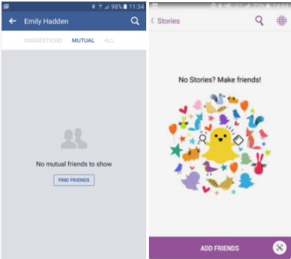
Facebook’s empty state illustration reinforces their familiar default photo icons while providing users with a clear CTA button inviting them to “find friends”. Meanwhile, Snapchat’s empty state illustration reflects the app’s playful and youthful brand positing through a colorful design. The necessary action is made very clear by the large, purple “add friends” button.
Empty state illustrations shouldn’t be too complex, or they may distract the user from taking the desired next action. These illustrations are eye-catching and on-brand, while still leaving room in the design for the copy to be easily read.
Understanding empty states UX
Empty states UX can help users achieve their goals when using software, apps, or websites. They can include directing new users to templates that will help them get started with the software they are using.
However, empty states UX best practices are important beyond just helping new users get started. Empty states can also occur when there is an error, an incorrect URL is searched, or an old URL is used. Using a website builder with managed WordPress hosting makes it easy to ensure the right empty states page appears whenever a user navigates to an incorrect URL on a page, ensuring they are guided back to the desired page.
They can be used to collect marketing intelligence by requiring a form to be filled out before the next page populates. Companies like Hubspot use this form-fill empty state when users want to access certain content.
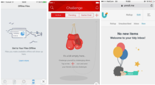
These screens are used to increase engagement, prompting users to participate in the next step the designer wants them to take. They can also be used as an explanation for why something on a website isn’t responding. For example, Yelp uses an empty state screen that has a construction visual cleverly paired with funny text that adds humor to a frustrating circumstance.

9 best practices for UX design
1. Guide the user experience
Take this opportunity to relay information to the user. This can include the next step they should take, a warning of a broken link, or anything to prevent a poor user experience. This guided interaction with the user can really influence their ultimate decision on whether to stay on a website.
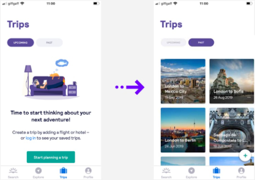
See the below example from Skyscanner.
2. Choose your words carefully
Phrasing the right message is an extremely important UX best practice. The message should be clear so that it isn’t easily misinterpreted. The written explanation should help the user understand what they need to do next. This could be anything from creating a profile to adding other users to a network. This written guide should be concise so that the user can easily take the next appropriate step.
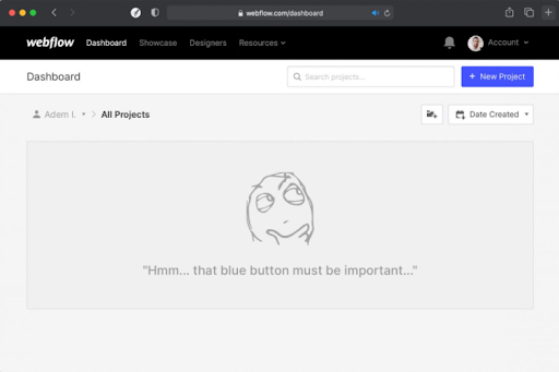
3. Use visual content
Engage with the user beyond just words with some well-designed visual content. This branding opportunity should include an image that matches the text. Make sure the creative is not too flashy or large and that it is a visual representation of the text in the empty state. The addition of an image makes the empty state appear more professional and appealing.
4. Include a button
Buttons are a clear prompt to guide the user to where the designer wants to take them. This engineered experience can take users anywhere on the site. It can direct them to add contacts to a client list or add a social platform to software such as in the Vendasta Snapshot Report. This report is an automated sales intelligence tool that pulls a marketing needs assessment for prospects from their available information online.
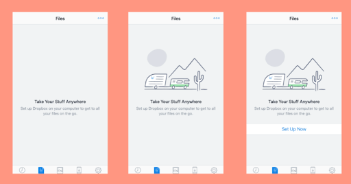
See the progression of the below Dropbox empty state including thoughtful text, a matching image, and a button.
5. Prompt the user to click somewhere on the page
This could be helpful when the user is just getting started on your website or within the software. Include a short description and arrows pointing to a few of the important buttons located on the screen.
6. Backlink to content
Add a backlink into an empty state that links to a piece of topical content. This best practice is a good one to follow if a content library is readily available on the website -- anything giving information about your website that might be helpful to a user. This could include a link to a demo, high-level blog, or informational how-to article.
7. Ensure designers and developers have a good working relationship
In the case where an empty state addresses a technical issue, such as the classic “Error 404”, this generally means there is a huge disconnect in the communication between developers and designers. These unhelpful messages likely haven’t been vetted by a designer and confuse the user experience.
8. Test and iterate
After designing an empty state UI, it is essential to test it with users to ensure that it meets their needs and expectations. Conducting user testing can help designers identify any issues or areas for improvement and make necessary adjustments. It is also important to iterate on the design based on user feedback and continue testing to ensure that the empty state UI is effective.
9. Consider personalization
Personalization is becoming increasingly important in UX design. The empty state UI can be an opportunity to personalize the experience for the user. For example, if the user has previously interacted with the application and deleted all their data, the empty state screen could display a message like "Welcome back [name], you've deleted your progress. Would you like to start again?" This personalization can make the user feel more connected to the software, website, or application, increasing usage and engagement.
The Takeaway
Empty states:
- Increase customer acquisition
- Increase customer retention
- Reduce website bounce rates
- Increase customer engagement
Not only are empty states a road map within websites and software, but they also tell the user the benefit of following the next steps.
Tools like the Snapshot Report use empty states to help you increase customer acquisition by assessing prospects' digital marketing needs. For example, you’ll be able to see their performance in listings, reviews, social media, websites, digital advertising, SEO, and ecommerce, and empty states will prompt the best next steps to take.