Best practices and principles for landing page UX design
If you're expecting your new landing pages to perform well, your UX design practices need to stay up-to-date with market trends. Understanding the best practices, techniques, and principles of UX design for landing pages is essential in creating a positive experience for your clients and their customers.
Help local business clients make the move to digital. Download the “Ecommerce post-pandemic playbook” today for actionable tips.
In this article, we’ll review the best principles and practices to follow for achieving high-performing landing page UX design, and give you tips for your client’s landing page to positively impact their customer’s experience with the site while increasing conversions along the way.
Why landing page UX design is essential to web design
UX design is the process of creating a seamless experience for someone navigating your website. Landing page UX design is also critical when reselling website solutions to your clients because it’s the first impression potential customers will have of their brand, product, or service. A well-designed and optimized landing page can convert visitors into leads and leads into customers.
For users to have an enjoyable experience using your website, you must consider how someone would navigate your site. You want the general theme and layout to look good, but it also has to remain functional. Landing pages with poor UX design have high bounce rates, meaning users can get easily frustrated and leave your site without completing important actions, such as filling out a contact form or adding an item to their shopping cart.
Principles of landing page UX design you should follow
1. Improve productivity and performance
A good UX design can help improve your landing page's conversion rate. A conversion is a visitor's action on your website, such as signing up for an email list or purchasing.
The primary purpose of landing pages is to convert visitors into leads or customers. A conversion rate is often calculated by dividing total conversions by total unique visits (or sessions).
The main focus of a conversion rate optimization (CRO) campaign is to increase the number of conversions on your website. Higher conversion rates mean more people are taking action on what you offer them online, which means you're doing something right.
2. Provide an exceptional user experience
If you're not sure what a good landing page looks like, check out these examples:
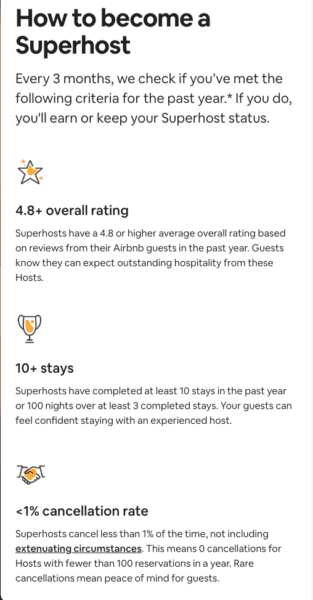
Airbnb
The landing page for Airbnb is clean and straightforward. It has just enough text to explain what the product does without overwhelming users with too much information.
In addition, there are no distracting elements on this page that would make it difficult for users to focus on what they need from this site (which is typically accommodation).
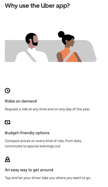
Uber
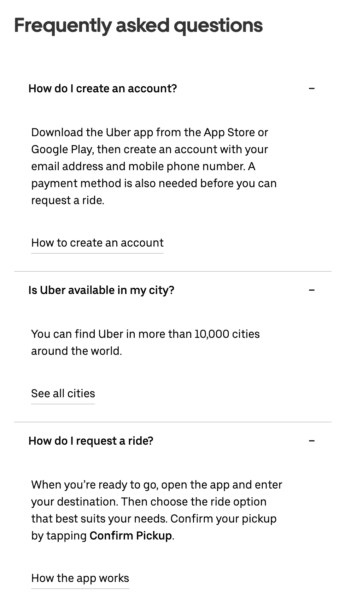
The design of Uber's website makes it easy for people who need to become more familiar with ride-sharing apps to understand how they work by providing step-by-step instructions on how to take advantage of their services.
They've also explained why their service is better than others in your area by highlighting key features such as reliable driver availability and low prices compared with taxis or other car rental companies.
3. Ensure landing page UX designs are up-to-date
Your UX designs should always be up-to-date with market trends. For example, if you have an eCommerce business and you notice more mobile users abandoning their shopping carts than desktop users, consider redesigning your landing page so it’s more accessible to mobile shoppers.
Integrating new technologies
More recently, web designers have started leveraging AI and machine learning algorithms to enhance UX design by providing a more personalized experience based on user preferences (Bootcamp). This is useful when dealing with large amounts of data, as it can help automate processes and eliminate redundant tasks. For example, suppose you are running an eCommerce business that sells designer bags and accessories. In that case, NLP can help identify each product's model number and brand to add them to the inventory management system for the site.
4. Practice progressive disclosure
Progressive disclosure is a technique for revealing information and options to users as they continue engaging with your website. Using this technique to create a great user experience on landing pages by displaying the most essential features at first glance until supplemental information is needed. That way, your visitors can process your page’s information in a more digestible and user-friendly way.
For example, if someone visits your sales page for a new product, don’t show them all the different variations of that product immediately. Instead, show them just one or two options initially and then let them click through to see more details about each option if they want it.
Avoiding information overload
Users might not want to spend time reading through all of your product/service features at once, and it might run the risk of information overload. If you show them the essential options first, and then let them discover each variation on their own, they'll have ownership of their research and an easier time comparing their different solutions. This technique also lets users easily opt out of solutions they're not interested in, without having to navigate through all your content and potentially losing interest.
Best practices for better landing page UX design processes
An effective landing page is critical to a successful marketing campaign, and a well-designed landing page has several key elements that help achieve these goals. We’ll outline some best practices you should follow when designing your next landing page for clients.
1. Understanding your audience
Before you start building your landing page, it's essential to understand who your audience is. You can only expect some people visiting your website to have the same goals and pain points. Your job is to determine what they want from their experience on your site and then ensure they get it.
- Understand the audience's goals: What do they want? What are their needs? Do they know how to get what they need from you? If not, how can you help them find answers independently (without feeling like an idiot)?
- Understand the audience's pain points: What keeps this group of people up at night--or keeps them from buying from other companies instead of yours? Are there issues that arise frequently enough that addressing them in one place would be helpful for everyone involved (including yourself)?
2. Keep the design simple
Good landing page UX design can make a significant impact with your client’s customers since it’s your chance to get them excited about what they offer. Ideally, when done correctly, a well-designed and laid-out page can convince customers that your client’s products are worth their time and money.
But if your landing page’s UX design has too much going on, it can do more harm than good. To keep things simple:
- Use a single call-to-action (CTA). You'll want one CTA that stands out from everything else on the page—and ideally leads directly back toward your product or service offering. This could be an image button with text like "Sign Up Now" or "Buy Now," but don't overdo it by adding multiple CTAs throughout the page; this will confuse visitors who aren't sure which one to click.
- Stick with one color scheme and font type throughout all landing page design elements, including text blocks, links, buttons, and forms. The last thing you want is for someone visiting this page because they're interested in learning more about what you do, only to find themselves overwhelmed by visual noise.
3. Using strong visuals
By using a variety of visuals, you can add interest and make your landing page more engaging. Don't just throw in any old images or videos—it needs to be relevant to your landing page’s content.
Remember you want your visuals to reinforce your message, not detract from what you say. Visual supports aid and enhances communication by providing users with speech, language, and communication needs.
- Make sure images are high quality. You want people viewing your site from their mobile devices (and even desktops) to see them clearly without having trouble loading them or suffering from pixelation issues when zooming in on them.
- Optimize your image file size. Likewise, ensure your file sizes for images do not exceed 1MB on your landing pages to prevent it from slow lading times and poor user experiences.
- Use consistent styling for all visuals used throughout the page. This includes fonts used for headings and body text and colors used throughout.
4. Write clear, concise, and compelling copy
The best landing page UX design is simple, clean, and easy to navigate while providing a clear path for your user. A practical layout is visually appealing without being too busy.
- Use short, simple sentences.
- Use action verbs to convey what visitors will do when they click your call-to-action button.
- Keep paragraphs short and to the point using bullet points if necessary (but not too many).
- Write in a conversational tone that mirrors how you would speak to them if you were chatting face-to-face. This helps create trust between you and your visitors because it feels more personal.
- User second-person pronouns (i.e. “you”, “your”) whenever possible to address your audience in a more personable and approachable manner.
5. Make the page easy to navigate
Providing an exceptional user experience is an important principle of UX design, so make sure your landing page is easy for anybody to navigate. When done correctly, any user should have no problems getting around the page without additional effort and confusion.
Here are just a few web design tips for ensuring your navigation is as intuitive as possible:
- Use clear navigation. If there's one thing that can make or break a user's experience with your site, it's how easily they can find what they're looking for on each page of your site or app--and this includes the navigation bar at the top of every page (if there is one).
- Ensure you've included all relevant links in the page. That way, visitors can easily find them when needed; otherwise, they may leave without completing their intended action.
6. Use consistent styling throughout all your pages
Consistency across your client’s website helps establish a brand identity while keeping things cohesive between sections. For example, your "About Us" and "Contact Us" pages might contain similar types of content but differ vastly depending on what information needs to be explained before taking action next step based upon the current stage.
7. Optimize, test, and refine the page for multiple devices
Digital accessibility in web design is not limited to just people with visual or auditory impairments. It also caters to those with slower internet connections or, in this case, those who want to use their smartphone or tablet to access the internet. All content on your site must be accessible using any device (desktop, mobile, or tablet) while ensuring that bandwidth is not an issue for anyone visiting your site.
To find out whether your landing page is mobile optimized, test the layout under different conditions, such as:
- Different Mobile devices (smartphones and tablets)
- Different operating systems (iOS vs. Android)
- Different browsers (Chrome vs. Firefox)
8. Include social proof to boost credibility
Social proof is a powerful tool that can boost your credibility. It's a way to show that other people are already using your product or service and can help convince visitors on your landing page that they should be too. Social proof can take many forms: testimonials, reviews, and ratings are all practical uses of this tactic.
For example, if you have an online store with products for sale, include customer testimonials at the bottom of each product description page--this will help reinforce the trustworthiness of what you're selling by showing people how others have benefited from it in the past.
Frequently asked questions
What is a landing page in UX design?
A landing page is a webpage where users arrive when clicking on a link from elsewhere, such as an online ad, email promotion, or social media post. The purpose of good landing page UX design is to create a positive user experience that prompts visitors to take the desired action. This could include signing up for newsletters and downloading resources.
What are some essential landing page design elements?
Design elements that are essential to creating effective and engaging landing pages can include a clear call-to-action (CTA), simple, uncluttered layouts, optimized images and visuals, concise copy that emphasizes benefits, user testimonials and reviews, and of course, an easy way to contact customer service or support.


